What the Vonk?! Lay out the lay-out
In the previous edition I have discussed the complete process from goofing around during a meeting, to the publishing of an article. While doing this, I skipped over a rather important aspect of an article: the layout.
The layout is in fact by far the most time consuming aspect of creating our magazine. Roughly 90 percent of the articles that are published by the Vonk are actually written by members of our association. This decreases the workload on our committee, but also ensures that each edition of The Vonk is a very good reflection on what our wonderful association stands for and was has been happening over the past few months.
Starting the process
The starting point of every layout session is the raw article. There are various ways the resources of an article could be delivered to us. As a committee we prefer to obtain the article as a plain text file with seperate files for images. However, we do not impose these requirements on our writers. Usually it is already enough work for them as it is to write an article, so we give them the freedom to deliver us whatever format they would prefer. If we are really unlucky, we only receive a pdf generated by LATEX. These pdfs obtain end of line characters after every line, which have to be removed manually. Also sometimes we receive Word documents with the images embedded in them. We then need to extract the images from the file and save them manually. This is not much work, but does require extra steps.
The Vonk layout
For making the actual magazine, our committee uses Adobe InDesign. For each article we start of with a bare template. Besides the content that needs to be added, there are some other things that need to be set properly.
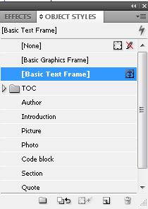
Figure 1: The toolbar that holds all predefined object styles that are used in The Vonk.
The structure
Every article needs a title and potentially a subtitle. In our design template, we have defined various styles that allow us to do this. In total there are five kinds of styles: object styles, paragraph styles character styles, cell styles and table styles. For creating The Vonk, we only regularly use the first two.
The object style determines how an object behaves. Examples of objects are: every single image, the title, a column of text, etc. Figure 1 shows the objects styles that we use for The Vonk. These presets make sure that the text wraps around an image nicely, that every image has a border around it, and also that the objects have the right spacing with respect to one another. For instance, the object style ‘author’ includes margins on the top and bottom to make sure that the introduction starts below the underlining of the author and also that there is a predetermined amount of whitespace between the author and the (sub)title.
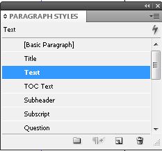
Figure 2: The toolbar that holds all predefined paragraph styles that are used in The Vonk.
The object styles themselves also include a paragraph style. The paragraph style holds settings for all text that is present inside that specific object. When applying a paragraph style to a certain object, it automatically sets the font, the font size, bold or italics, and so on. For instance, the introduction is automatically put in bold font.
Paraygraph styles can also be applied individually. It is therefore possible that an object holds multiple paragraph styles for different parts of that object. The test you are reading now is part of the same object as the subheaders, but the subheaders obviously have a different look and thus also a different paragraph style.
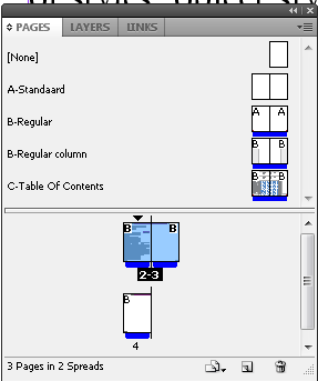
Figure 3: The pages toolbar that lets you select that masterpage or the regular content pages. In this figure content pages 2 and 3 are active.
The masterpage
During the design there are in fact two layers present: the actual content and the master page. Each of these have their own specific function.
The content layer holds the content of the entire article (doh..). This means that all the article specifics are to be put in this section.
If the master page is then selected, all the the content disappears. You are then left with the bare template again. The master page defines the color scheme of the article, but also manages the footers of every page.
While doing the layout of an article you have to be careful to not put the content in the master page. Eventually all masterpages are syncronized with one another. If you use a masterpage with content in the masterpage, this content is then projected on every other article as well!
The above is quite easy to fix, but if another master page is used for the synchronization, the content that was present for that specific article is wiped clean. So if you are not careful all your hard work may be for nothing.
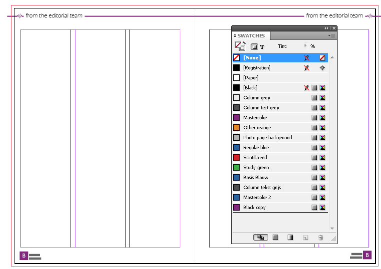
Figure 4: An example of what the masterpage of a regular Vonk article looks like. On the Right, the toolbar that controls the color schemes is shown.
Finishing up
Once all the text is put in the file and the article has a nice header in the right color, some creativity is required. Although we try to obtain articles with a number of words that corresponds to the amount of space that we reserved for it, this is not always the case. It is almost impossible to make articles smaller. You cannot just remove text and also the spacing and font size cannot be altered. Therefore we almost always opt to extent articles if the word count does not comply with the set amount of pages.
However, even when we have the approximate right amount of words, if you just put everything in the layout, you are almost certainly going to have some white space left. This is were your creativity comes in. Sometimes you can easily resolve this by cropping or resizing an image. However, one of the most powerful tools of an editor is in this case the quote! Quotes are often used to attract the attention of a potential reader who is browsing the magazine, but they can also be very handy to fill up some empty space. If you ever wondered why some articles have three quotes and some have none, you now know they are used to simply fill up some unused space!
By the way, if you start layouting for The Vonk, you will quickly find out that the most efficient way to find appropriate quotes for an article is to simply do a text search on exclamation marks!
Article specifics
Some sections have a layout that is drastically different than other articles. An example for this is the table of contents (TOC). The TOC is in fact that different that we have created a seperate master page for it (which is also shown in figure 5). This master page does not include the usual items such as a title and predefined text boxes. Instead it has placeholders for all the items that are in the TOC.
This master page also includes the masterhead. The masterhead usually does not change very often. The number of copies varies a bit depending on the number of members Scintilla has and also the people that have worked on The Vonk change from time to time.
The masterhead also includes the date of publishing and the edition number. As you may have guessed, these are specific for each edition. We keep track of these over the entire document by using text variables. Text variables can be assigned a value in the masterpage that will be used as the template for all the other articles. After synchronizing all the master pages, all text variables will be updated and show the right numbers. If you have paid attention you may have guessed that the masterhead of the TOC will require manual updating. This page uses a different masterpage and will thus not be updated along with all the other articles.
In the table of contents, all the articles that are published in that edition are listed in the center. Unfortunately, these have to be created and organized manually. This is usually one of the last steps that are performed when finishing the layout. The colours of the numbers are defined in very much the same way as the color scheme of each individual article and should correspond to the family class an article belongs to.
In figure 4 the swatches toolbar is shown and all the various article families we use for The Vonk are listed here. We got Scintilla red for every article that is associated with Scintilla itself. There is study green for all study related articles such as bachelor or master assignments, but also changes to the programme or the educational model belong to this family. The Vonk also has some recurring articles such as the Solarteam, Green Team, Roboteam and our datasheet, these are to be coloured by regular blue.
For the ‘What the Vonk’ articles I actually created a new color style in purple. As you can see this is is currently still named ‘black copy’. This color style has not been added to our template yet and so I still had to add it manually to the list. For the next edition I will have added ‘editorial purple‘ to the template and it will be ready to use.
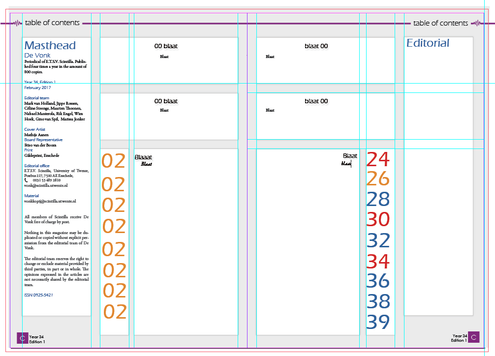
Figure 5: The masterpage of the Table of contents page.
Closing remarks
I am pretty sure that I have forgotten countless little quircks and particularities about doing a layout, but I hope you have now a much better view on how The Vonk comes together. If you have become wildly enthousiastic by reading this, and my previous ‘What the Vonk’ article (how could you not?), then do not hestitate to contact us about contributing to this great magazine at vonk@scintilla.utwente.nl. You can of course also always stalk one of the board- or committee members.